Role
Visual & Interaction Design
Timeline
Q3 2025
Project Type
Product Improvement
Result
Eliminating Ambiguity, Fostering Driver Trust
Project Brief
Connecting Available Drivers to On-Demand Trips
Darter is a trusted, specialized B2B route optimization platform managing the complex transport for partner companies, ensuring radical efficiency in life-critical scheduling. Our professional drivers must communicate their real-time availability status when they are between scheduled trips. This signal is crucial: it instantly integrates the driver into Darter's powerful engine, guaranteeing they are matched with highly optimized on-demand assignments, directly upholding Darter's mission of peak efficiency.
Problem
The current system, which may rely on background checks, logging in/out, or automatic assignment logic, presents several Problem:
Drivers currently lack a simple, explicit, and visible way to signal their immediate readiness (or unavailability) to accept trips. This leads to confusion and frustration.
Drivers are often assigned trips when genuinely unavailable, leading to systemic inefficiency and customer dissatisfaction. High Rejection Rates, Longer wait times
The ambiguity of availability creates a stressful experience for drivers, who feel they must constantly monitor the app. for ignoring trips they couldn't possibly accept.
Goals
Design an availability control that is clear, accessible, and safe to interact with in a map-heavy driving interface.
Driver's ease of use
It should be positioned in a spot that’s easy to reach during driving, while still respecting the limited real estate dominated by map and navigation elements.
Eliminating Ambiguity
The control must instantly communicate whether the driver is Online or Offline, allowing them to understand their status at a glance without cognitive load.
Intentional Interaction
The action must feel quick and purposeful, reducing friction for drivers who need to switch states, yet protected enough to prevent accidental taps.
Desk Research
The Evidence
To conquer our UI/UX obstacles, we conducted focused desk research to establish the fundamental truths necessary for the design. This evidence will directly inform the solution.
Clarity
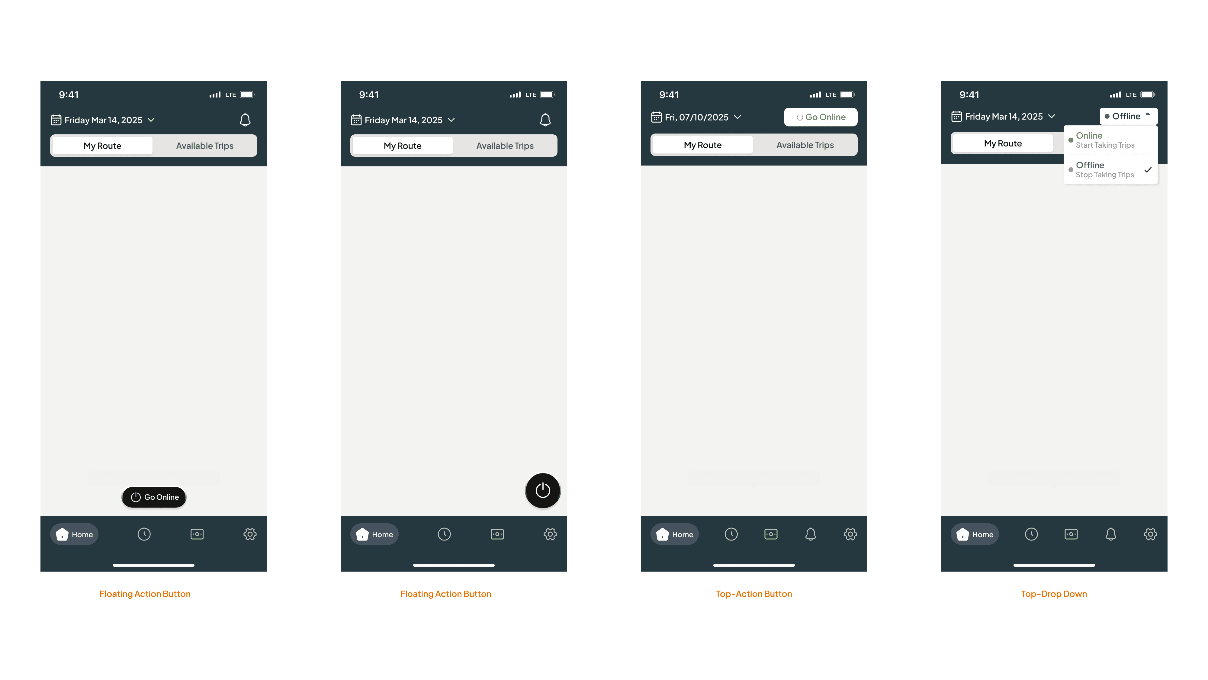
Our analysis of high-visibility mobile interfaces confirmed 3 placement prioritizing maximum accessibility: Top Bar, Bottom Bar, or Floating Action Button
Principles
The research confirms that an instantaneous toggle is the correct interaction pattern. To eliminate all ambiguity
The Interaction
The interaction must be both effortless and safe: Tap Area Size, Immediate Feedback, Strategic Friction (To prevent accidental action)
Components Exploration
Control Type
Trying several UI component approaches. Focus on which UI component best serves the function and context.
Button
Ideal for triggering a single, clear action. It provides immediate feedback, making it easy for drivers to understand the result right away.
Dropdown
its two-step interaction (tap to open, then tap to select) requires more intentionality, effectively preventing drivers from making accidental status changes while on the road.
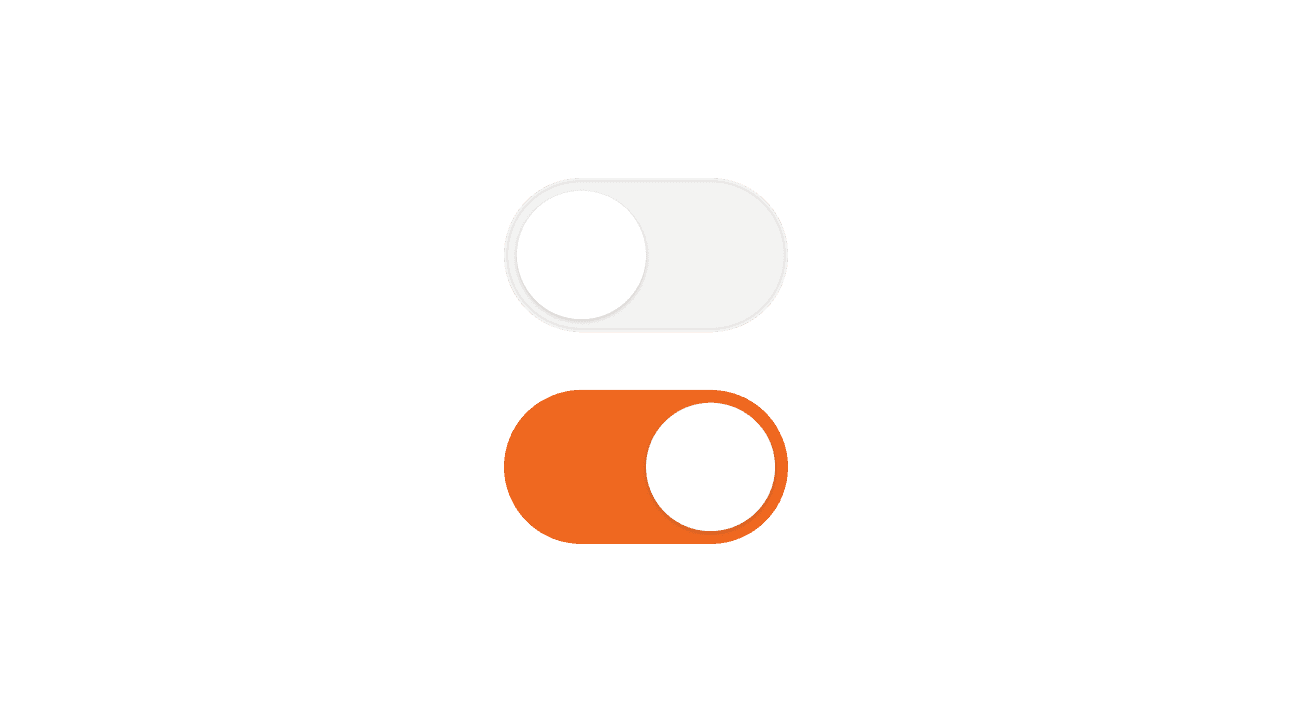
Toggle
Typically used for switching between two persistent states. But for this case, a toggle isn’t suitable because the change needs to feel more intentional, more visible, and provide stronger feedback than a simple switch can deliver.
Design Exploration
Control Placement
Explore where on the Driver App Home Page this control should live. It's need to be accessible and visible on all the possible cases.
Idea
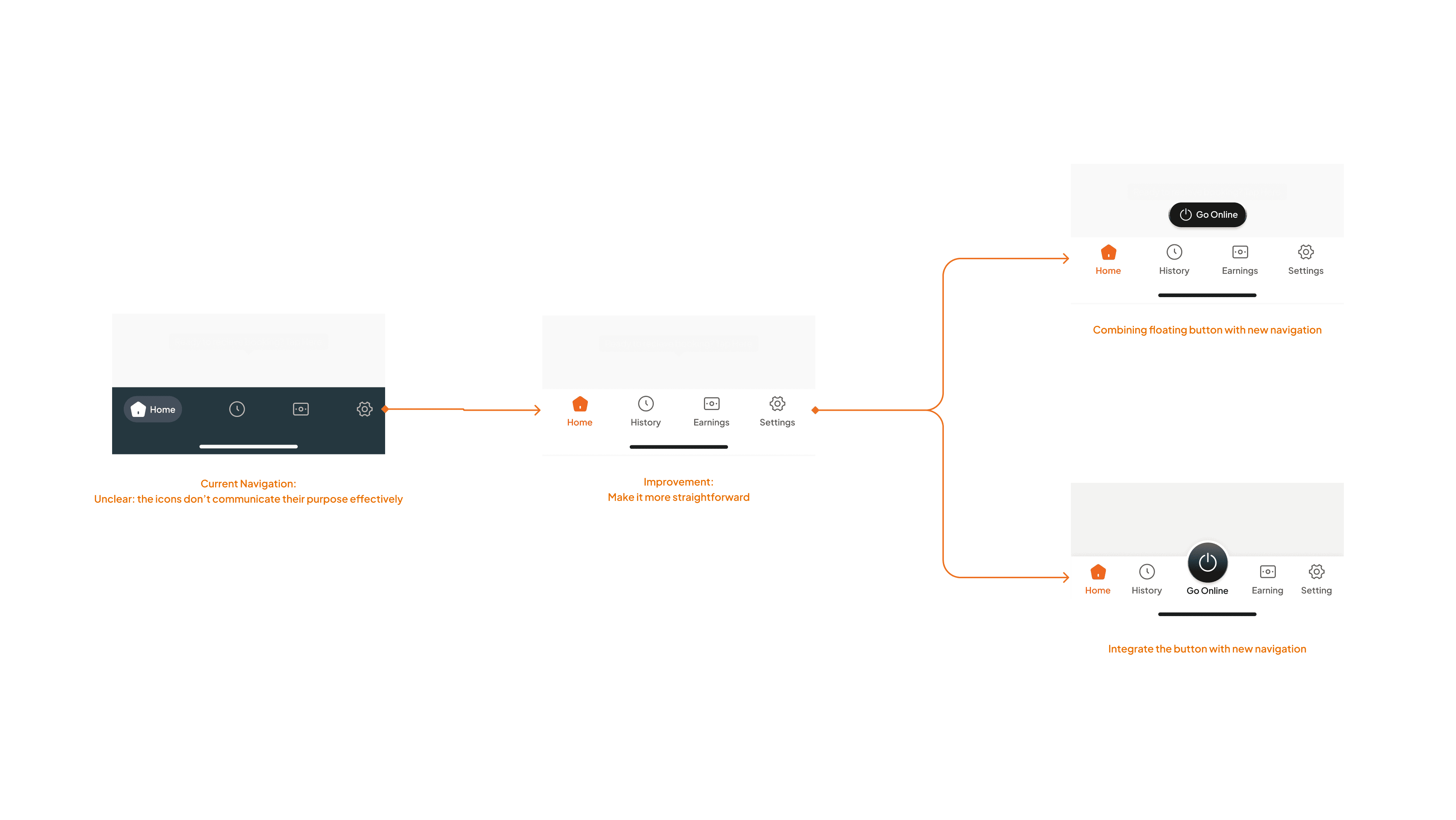
Navigation overhoul
The current navigation isn’t intuitive, with icons that don’t clearly represent their functions, leading to confusion and slower decision-making. A redesigned, more descriptive navigation can greatly improve clarity, usability, and overall task efficiency.
Design Exploration
Utilizing Color
I will strategically utilize color to define every state of the availability switch, transforming it from a simple indicator into a high-confidence communication tool. This approach ensures instant clarity and minimal cognitive load for the Drivers

Interaction Exploration
Prototyping, Present, Getting Feedback
Create every state and build a fully interactive prototype that mirrors real user flows. This helps validate assumptions early, uncover usability gaps, and gather meaningful feedback from both the team and users before moving into refinement.
Opt- 1
Opt- 2
Opt- 3
Opt- 4
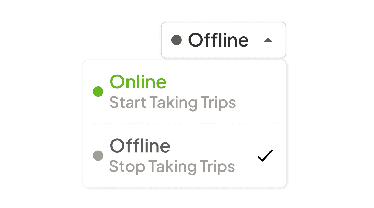
Decision
Moving Forward With Option 3
After discussing the options and gathering feedback, the team decided to move forward with Option 3. It stood out because the placement stays out of the way, the interaction is clear, and drivers can recognize the status instantly at a glance. It’s the option that keeps everything clean, readable, and practical in real use.
Idea -> Enhancement
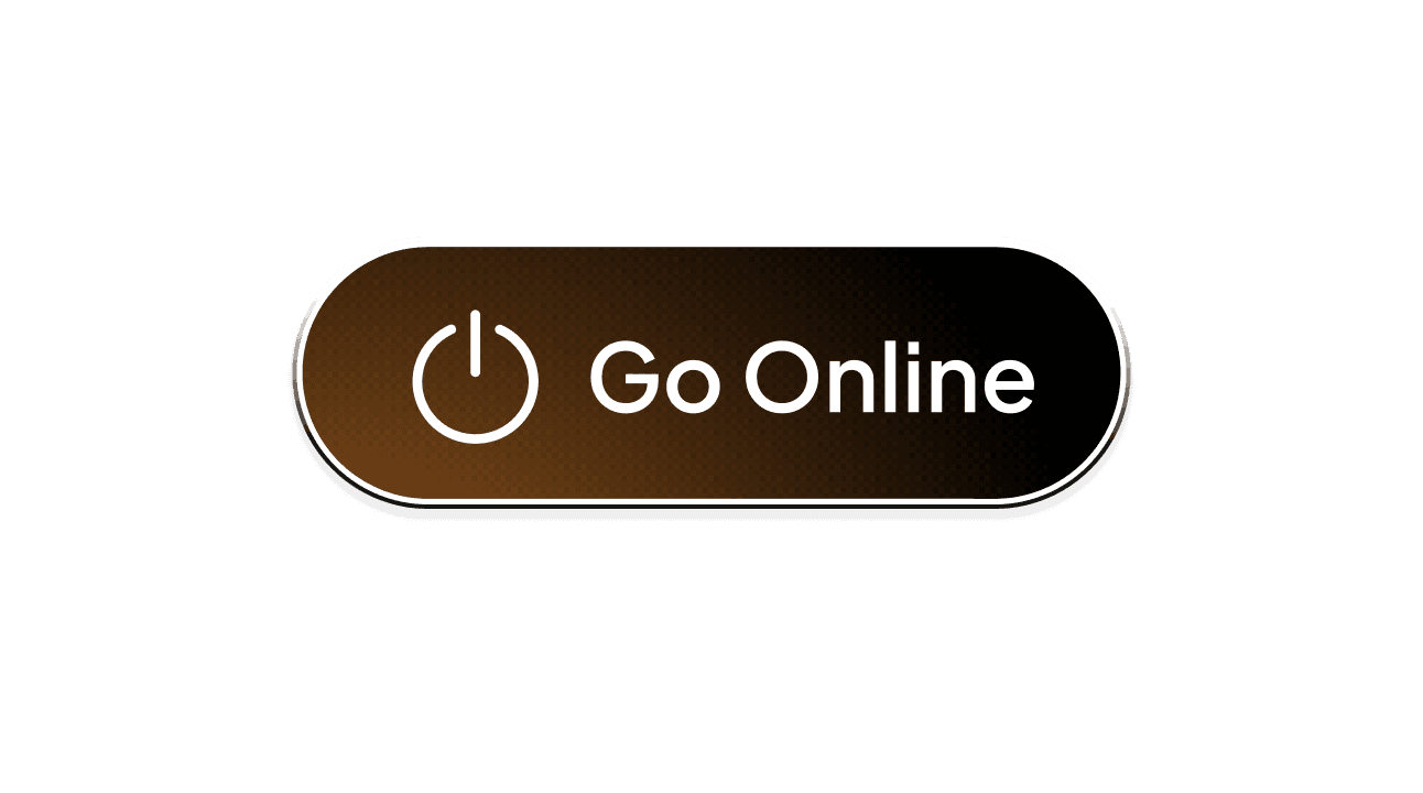
How to make the Call to Action literally "Call"
I wanted the main action—calling the driver—to feel unmistakably clear without disrupting the rest of the interface. So I explored a subtle but attention-grabbing approach: an animated gradient. I built a Lottie version to test the motion and integrated it into a new prototype. The result is a button that naturally draws the eye, signals its importance, and still stays harmonious with all other components.
Final Touch
Showing end-to-end interaction
In the final prototype, I mapped out the complete flow of a driver going online and then returning offline. I wanted the transitions to feel smooth and predictable, so the team could clearly see how each state changes in real time. This walkthrough gives a simple, end-to-end view of how the interaction will look and feel once implemented.
Result
Driving Clarity and Confidence
The new design successfully transformed the availability control into a high-confidence tool, delivering two key impacts:
Eliminating Ambiguity
Problem
Lack of Driver Control & Ambiguity
Solution
The enhanced dedicated button (providing a simple, explicit control) combined with strict Color and instant feedback ensures the Clarity of Driver status.
Impact
For Driver: Full confidence and control over their status with instant clarity at a glance. This eliminates the frustration of being assigned trips when genuinely unavailable..
For Business: A critical reduction in systemic inefficiency, minimizing trip rejections and providing high-fidelity data that leads to more reliable, faster service times.
Fostering Driver Trust
Problem
Psychological Friction
Solution
The design provides clarity on driverstatus (Online/Offline) and optimal placement for accessibility without clutter. Crucially, the interaction requires a intentional tap (supported by distinct haptic/visual feedback) to effectively prevent unintentional status changes.
Impact
For Driver: Eliminates the need for constant monitoring; drivers feel psychologically freed when Offline. The deliberate tap ensures they trust the system and reduces accidental trip assignments.
For Business: Better driver retention and a more focused workforce, as the system minimizes frustration caused by unexpected assignments.