Designing Systems 0 -> 1 for Darter

Shaping a design foundation to eliminate confusing UX, driving scalable growth through consistency, alignment, and efficiency.

Role

System Designer

Timeline

Q1 2025

Project Type

Design Systems

Result

Design Systems that boosted product shipment & Increasing user trust, make better User Experience across Darter platforms.

Design Systems

Design Systems

Visual design

Visual design

Visual design

System Thinking

System Thinking

System Thinking

Process Optimization

Process Optimization

Process Optimization

Context

What's Darter?

0.00 M

Trips optimized in 2 years

Darter is a specialized route optimization platform built to radically improve fleet efficiency, particularly for medical transport. Having already optimized 1 Million trips over two years, the business has proven its model and is now on track to aggressively expand its services and establish new partnerships.

Darter is a specialized route optimization platform built to radically improve fleet efficiency, particularly for medical transport. Having already optimized 1 Million trips over two years, the business has proven its model and is now on track to aggressively expand its services and establish new partnerships.

Internal Research -> Problem

The Cost of Inconsistency: Fragmented UX and Organizational Drag

Organizational & Process Issues
Organizational Issues
  1. Absence of Governance

The company lacked an in-house design function, leading to a disconnected product development process without centralized design strategy or standards.

  1. Inefficient

The absence of a single source of truth resulted in an inefficient and time-consuming workflow, forcing teams to enter endless, repetitive debates over basic design attributes (e.g., specific color values, typography sizing).

Platform & UX Issues
  1. Lack of design foundation

The platform was built on a weak foundational layer, teams were unintentionally rebuilding the same components repeatedly, slowing down velocity and increasing maintenance cost.

  1. Fragmented User Experience

This lack of foundation caused a scattered visual hierarchy and conflicting component behaviors across the product, resulting in a confusing and inconsistent experience for the end-user.

Strategic Alignment

Business Enablement
Business Goal

The core mandate was to create a scalable web and mobile platform foundation to support the company's expansion to more cities and services.

Product Design Goal
Design Goal

Established a clear, measurable strategic objective for the design team. Framed the design project as critical business enablement, not just a cosmetic refresh.

What we did? ->

Audit the Process

Roadmap

Immediately involved and aligned all critical stakeholders (Product, Tech, Operations) early in the process. We mapped and documented the entire platform's flows, capturing visual inconsistencies and interaction flaws.

What we did? ->

Audit the Process

Roadmap

Immediately involved and aligned all critical stakeholders (Product, Tech, Operations) early in the process. We mapped and documented the entire platform's flows, capturing visual inconsistencies and interaction flaws.

What we did? ->

Audit the Process

Roadmap

Immediately involved and aligned all critical stakeholders (Product, Tech, Operations) early in the process. We mapped and documented the entire platform's flows, capturing visual inconsistencies and interaction flaws.

Design Goals

Have a Design Principle as a Guide

A strategic principle drafted to help prioritize decisions, focus efforts, and ensure long-term product quality for aligned team outcomes.

Clarity

Interfaces should communicate purpose instantly. Clear hierarchy, recognizable patterns, and accessible language guide users to the right action without confusion or extra thinking.

Efficiency

Every screen should behave and feel like part of the same system. Predictable components reduce cognitive load and make the experience feel trustworthy.

Scalabiility

Designs should scale efficiently across features, platforms, and teams. Consistent patterns reduce decision-making friction and speed up delivery.

Cohessivity

Every screen should behave and feel like part of the same system—consistent, predictable, and faster to understand. Cohesion reduces cognitive load and improves overall experience.

Next Step

Designing the Foundation

Typography

Color

Typography Problem

The current use of Montserrat presents two critical typographic deficiencies: its characters are excessively wide, leading to poor spatial efficiency and unnecessary layout constraints, and the typeface exhibits suboptimal number rendering, hindering the quick readability and clarity of numerical data and metrics across the product.

Designing Foundation

Typography Library
Testing and Validation across use cases

Auditing current styles, conducting usability and accessibility tests on some proposed typefaces and sizes across several product interface with internal design teams.

Typeface Selection

The choice of Plus Jakarta Sans is finalized as the primary typeface for the Darter Platform. This selection is made to ensure a modern, accessible, and high-performing font family is used across all user interfaces.

Creating Typography Library

A unified typographic scale (sizes, weights, and line heights) was established to ensure Clarity and Efficiency, and was immediately translated into design tokens and styles to guarantee product Cohesion.

Result

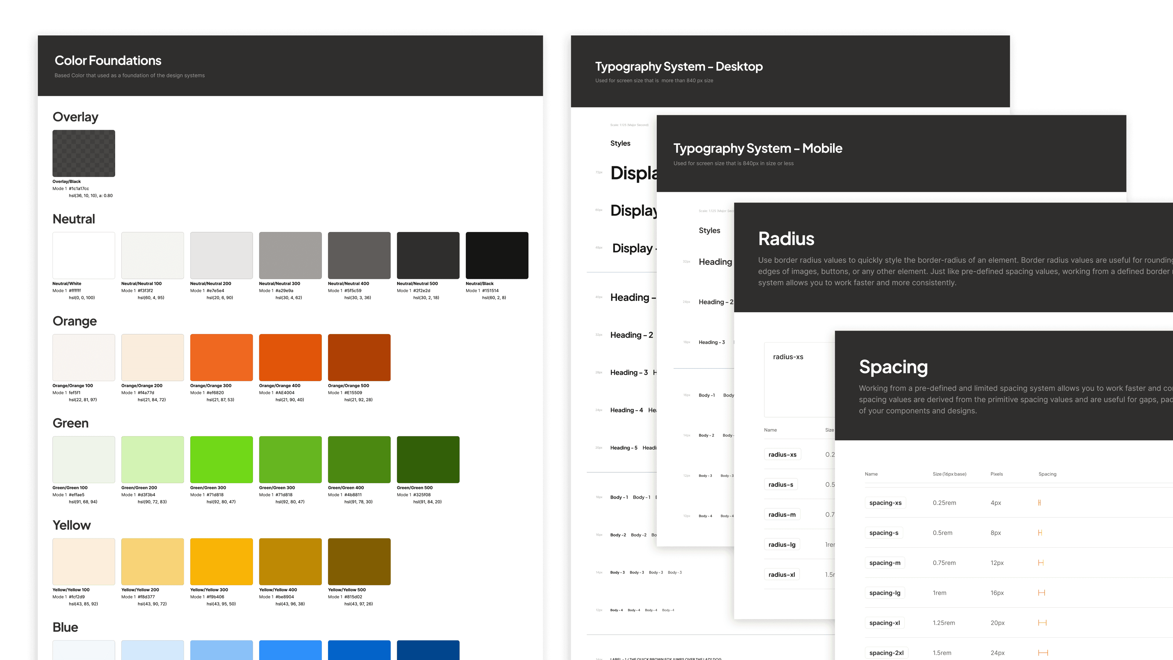
A new Scalable Tokens Library

Successful implementation of a complete design token library, centralizing typography and color as foundational elements, and establishing a cohesive numeric scale based on multiples of four (4px, 8px, 12 px, etc) for defining consistent spacing and border radius across all product components.

Growing the Design Library

Components Audit

With the foundational design token library now complete, the next crucial step was an intensive audit of existing components. Start with surveyed the entire product UI to identify areas of highest inconsistency and impact. This process allowed us to intelligently prioritize which components would be built first, ensuring our initial efforts delivered maximum cohesion and addressed the most critical user experience pain points.

Prioritized Build:

Maximizing Cohesion with High-Impact Components

With the foundational design token library now complete, the next crucial step was an intensive audit of existing components. We meticulously surveyed the entire product UI to identify areas of highest inconsistency and impact. This process allowed us to intelligently prioritize which components would be built first, ensuring our initial efforts delivered maximum cohesion and addressed the most critical user experience pain points.

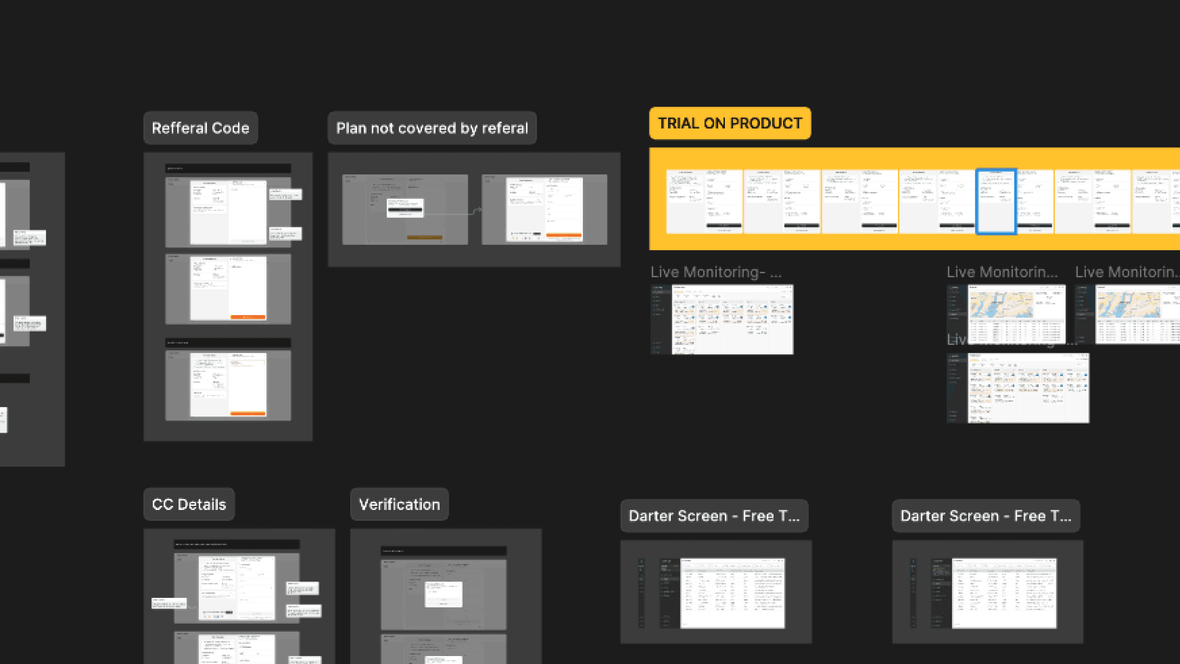
Straightly use on a Product & Growing

Applying our initial components to live products delivered immediate real-world validation, maximizing our Efficiency. We committed to treating the library as a living system, constantly refining it and filling gaps as new needs emerged during development. This iterative process is key to maintaining Scalability, guaranteeing the library remains the foundational source of truth for future growth.

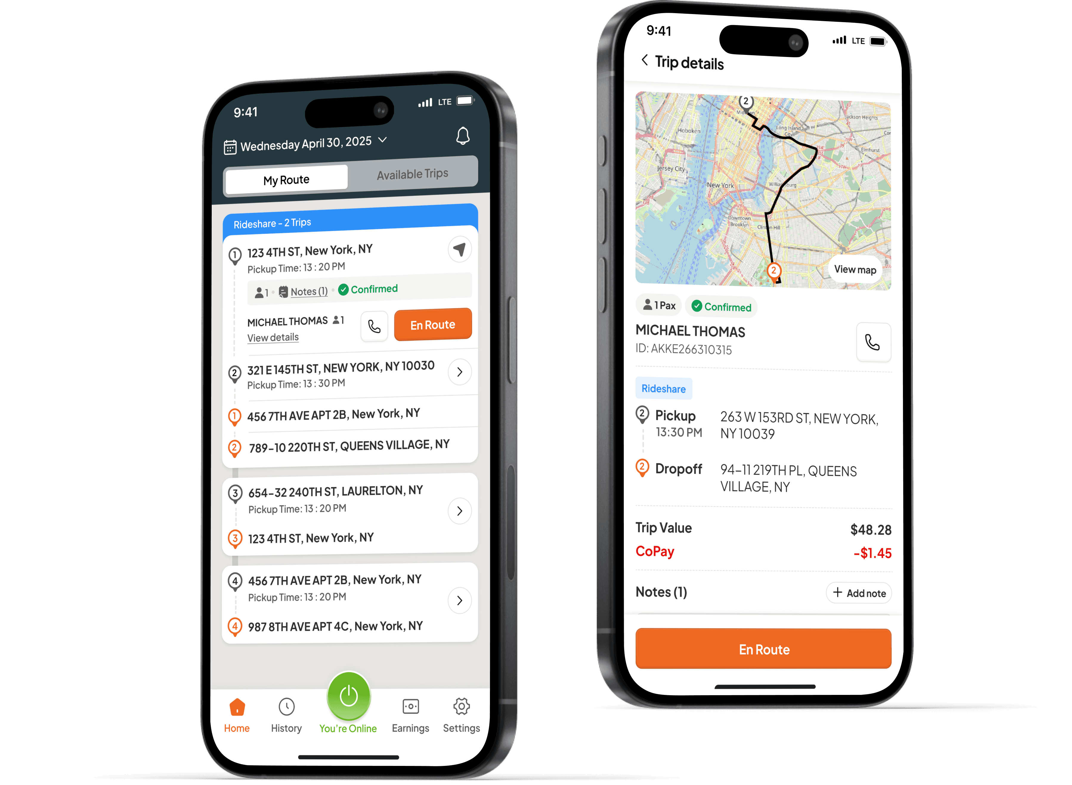
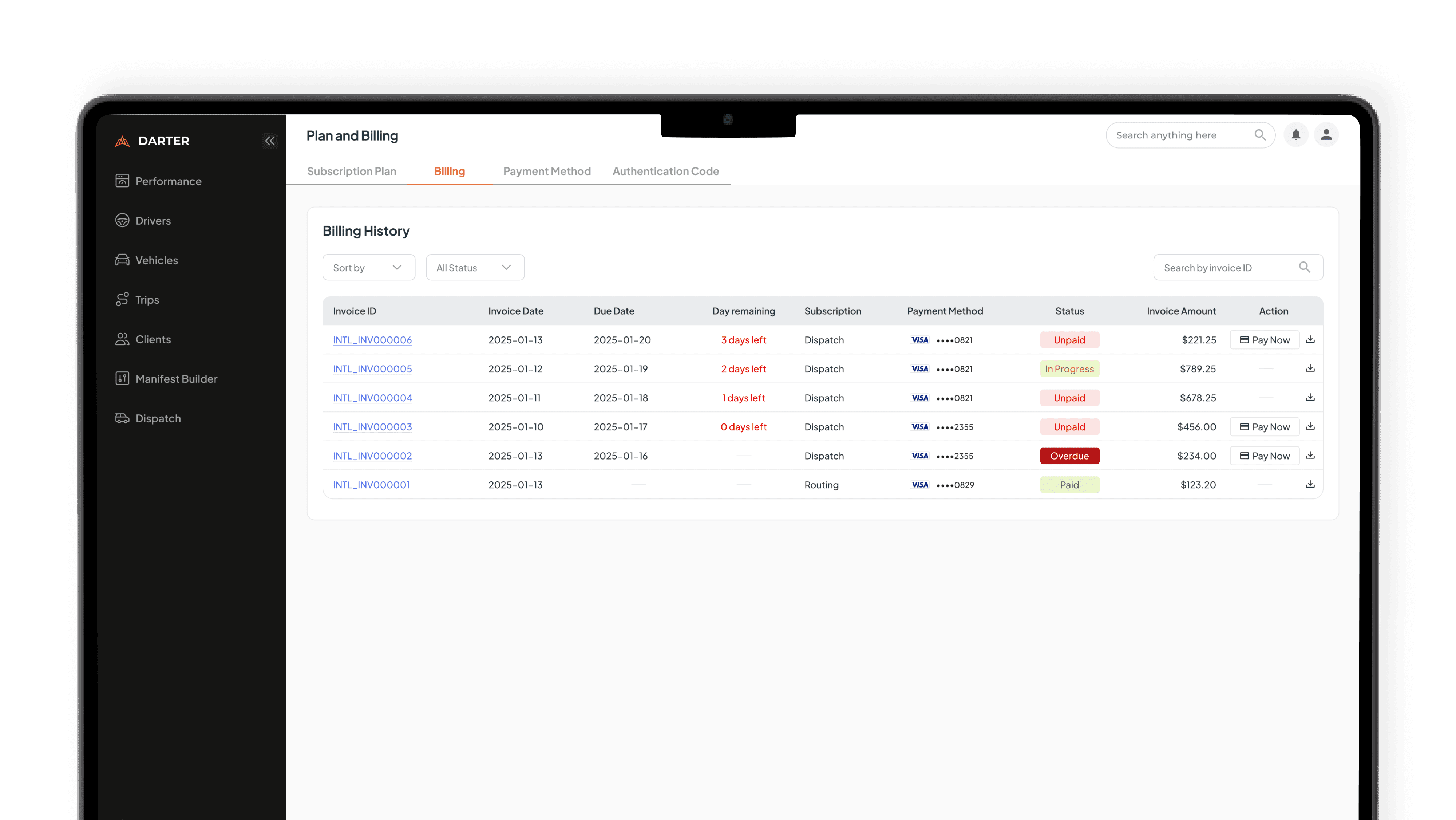
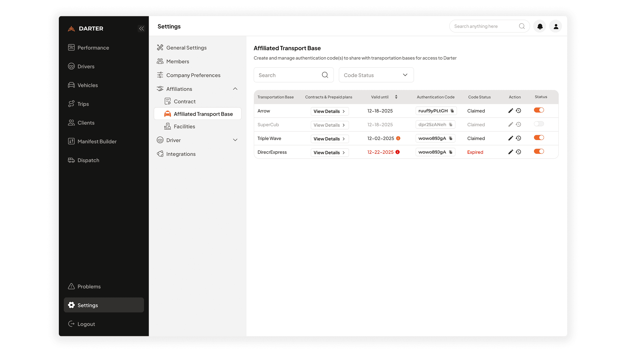
On Product Implementation

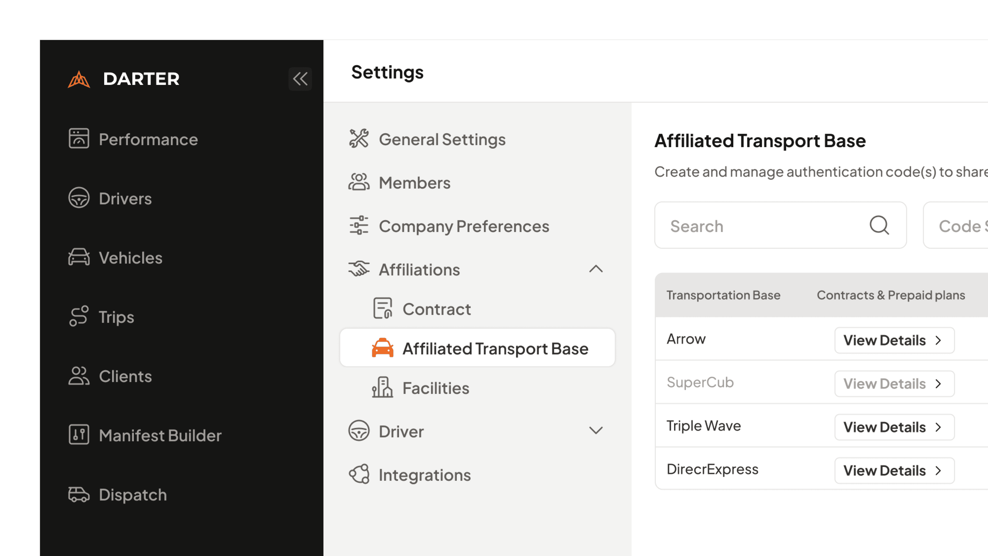
  1. Scalable Navigation Components

A refined navigation built for clarity, scalability, and cohesion across the product. It helps users move with confidence through a more structured and intuitive layout. As the product grows, the system stays consistent and easy to expand.

Before
After
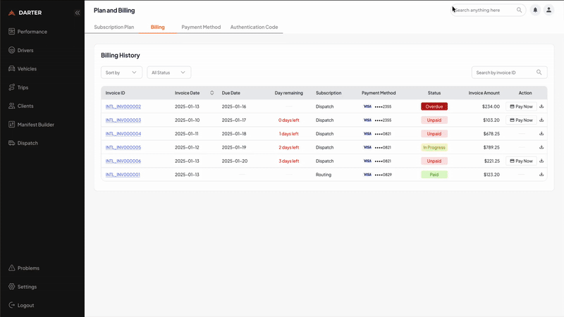
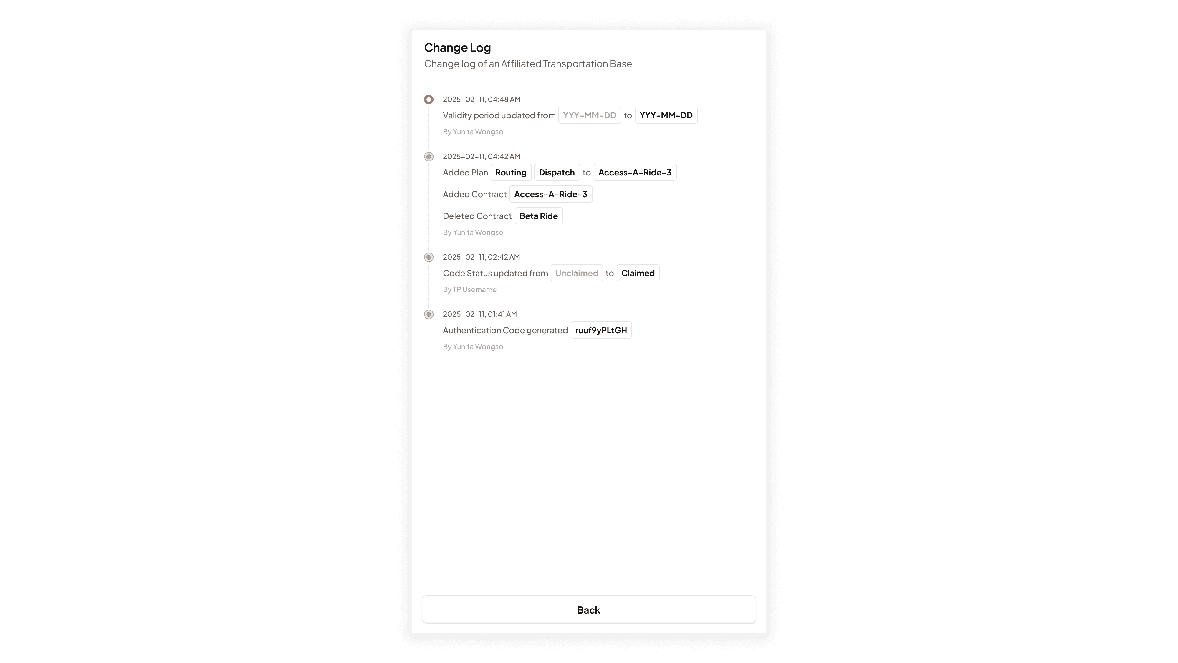
  1. Refining Change-log Components

A redesigned changelog that brings clarity and cohesion across the entire product. It helps users understand updates easily while keeping the component consistent and scalable for future needs. This ensures every release feels organized, predictable, and effortless to follow.

Before
After
  1. Clarity on Drivers App

A clearer, more cohesive navigation that guides drivers with ease. It improves how drivers move through the app by simplifying choices and organizing key actions. As the product grows, the navigation remains scalable, consistent, and effortless to follow.

Summaries: The Results

Design Principle

Design Libraries

Better Experience

Component Library 1.0: Delivering Quantifiable Efficiency

The successful launch of the foundational component library, built on a robust Design Token system (Color, Typography, Spacing), immediately established the single source of truth. This centralized asset model maximized workflow Efficiency, evidenced by a $75\%$ reduction in design handoff time and a rapid decrease in front-end code redundancy.

Summaries: The Results

Design Principle

Design Libraries

Better UX

Component Library 1.0: Delivering Quantifiable Efficiency

The successful launch of the foundational component library, built on a robust Design Token system (Color, Typography, Spacing), immediately established the single source of truth. This centralized asset model maximized workflow Efficiency, evidenced by a 75% reduction in design handoff time and a rapid decrease in front-end code redundancy.

Conclusion

Conclusion & Strategic Impact

This project was a critical intervention that transitioned the company from a fragmented, inefficient design process to a scalable, cohesive, and high-velocity product organization. The success of this initiative was built on a foundation of strategic research, principle-driven design, and rigorous execution.

Maximizing Efficiency and Scalability

Problem

The absence of a foundational layer led to teams rebuilding the same components, creating time-consuming debates and high maintenance costs.

Solution

We drafted a Strategic Roadmap prioritizing core foundations to quickly unlock engineering velocity. By establishing the Design Tokens Library, we eliminated guesswork, reducing design handoff time by 75%. This focus on efficiency is the engine of Scalability.

Defining Clarity and Cohessivity

Problem

Fragmented user experience and broken UI structure due to non-intentional color usage and poor spatial efficiency (e.g., the Montserrat typography problem).

Solution

I defined and rigorously applied the principles of Clarity (easy user comprehension) and Cohesion (visual consistency). This involved the Testing and Validation of new typefaces (Plus Jakarta Sans) and the creation of a semantic Color Library, directly solving critical user pain points and elevating overall product quality.

Strategic Alignment and Business Vision

Mandate

Create a scalable platform foundation to support company expansion, framing the design project as critical business enablement, not just a cosmetic refresh.

My Contribution

By mapping organizational friction to platform weaknesses, I ensured the resulting design foundation was not just a visual fix, but a targeted solution for accelerating business goals and guaranteeing long-term system adoption.

Interested in connecting?

Let’s talk projects, collaborations, or anything design!

Mail me

Interested in connecting?

Let’s talk projects, collaborations, or anything design!

Mail me

Interested in connecting?

Let’s talk projects, collaborations, or anything design!

Mail me