Role
Product Designer
Timeline
2020
Project Type
TV App Design Systems
Result
Faster Development, Increase Consistency and Better User Experience
The Context
when I joined in May 2020, the product—which is a Key Product of the company—was suffering from severe design and technical debt. The existing library was messy, full of broken components, and forced us to waste time rebuilding the same elements repeatedly.
This was my 0-to-1 opportunity to initiate and champion a solution. It showcases my core strengths:
I led the effort to clean up the existing chaos and implement a clean, usable library to make the TV product better.
I was motivated by the fact that the TV Apps were a key product, meaning consistency and efficiency were critical for the company's long-term success.
As the designer for the team, I proactively communicated with my manager to launch this vital organizational tidying effort.
Defining
The Problems
The existing design setup was characterized by severe design and technical debt. Specifically:
This fragmentation forced designers and engineers to repeatedly rebuild the same elements, resulting in excessive time consumption and slow feature development velocity.
The lack of a unified design system was a major obstacle to ensuring UI consistency and efficiently scaling the product across multiple TV platforms (like Android TV and Apple TV), threatening the product's long-term success.
The TV Apps had a chaotic, messy library with many broken components, leading to a state of component chaos.
Qualitative Insights
Problem Validation
Feedback
We received consistent feedback from both Design and Engineering teams confirming the presence of too many inconsistent and fragmented components across the TV Apps platform.
Consequence
This inconsistency forced engineers to write custom code for variations of the same element, leading to excessive technical debt and making our cross-functional workflow slow and unpredictable.
The Data
The lack of consistency directly resulted in user confusion and cognitive friction. When elements like buttons, navigation patterns, or inputs behaved differently across various screens, it degraded the overall user experience.
Consequence
A fragmented UI erodes user trust and makes feature discovery and task completion more difficult, ultimately hurting key metrics like retention and engagement.
Production Time
The combination of technical debt and broken components made the entire development process highly inefficient.
Consequence
Design handoffs were prolonged due to constant back-and-forth for component specifications, and engineering velocity was significantly reduced. This inefficiency represented a major bottleneck, directly threatening our ability to deliver new features that support the product's long-term roadmap.
The Goals
Recognizing this critical bottleneck, I initiated and drove the effort to establish a formal Design Library. My Goal was twofold: to bring stability to the current product and to establish the necessary infrastructure for future growth.
Estabilished a Single Source of Truth
Implement a clean, usable library to simplify complex workflows.
Accelerate Velocity
Significantly reduce design handoff time and eliminate repetitive work.
Long-Term Vision
Ensure UI Consistency and scalability across the entire TV Apps product to guarantee the platform's ability to meet aggressive expansion goals.
How Might We implement a robust and collaborative Design System that transforms the Vidio TV Apps team from a state of component chaos to one of high-velocity, consistent product delivery?
Approach
Way of Thinking
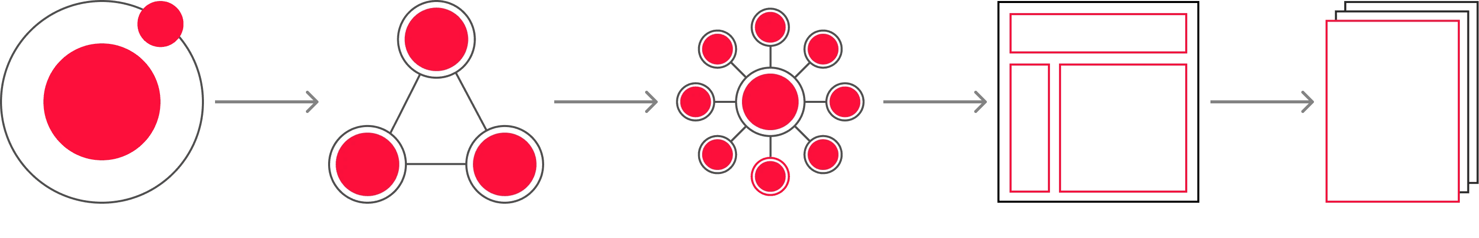
When tidying up the design system, I use Atomic design as a mindset to build consistence UI component
Process
Initial Audit: Uncovering the Debt
I started the project with a thorough audit, combining research and hands-on component review
Research
I studied Medium articles and reviewed TV guidelines from Google to establish best practices.
Inventory Analysis
I took an inventory of every UI element in the application by capturing, grouping, and inspecting the original design assets in Sketch.
This process immediately validated the need for a system: we found dozens of inconsistent color styles, fragmented typography, and components that were broken or used incorrectly across the entire application.
Design Process
Refine the structure
I started the project with a thorough audit and cleanup, all conducted within the original tool, Sketch. Reorganizing the remaining components using clear naming conventions to establish a hierarchy that made the library usable for the first time.
Challenges
Tools Migrations

Adding complexity to the project, the design team decided in December 2020 to migrate our entire tool stack: from Sketch & Zeplin to Figma. While strategically sound, this shift meant the established Sketch framework was lost, forcing a new phase of work:
Rebuilding in Figma
The existing Sketch "nested symbols" broke during migration, requiring me to manually rebuild, re-name, and re-group all components from scratch in Figma.
Mastering New Tools
I had to quickly learn and apply new Figma features like Variants and Naming Conventions to ensure the new system was scalable and robust.
Evolve: Building Design Systems In Figma
Architecture and Naming Conventions
The shift forced us to go beyond simple migration; we had to re-architecture the system completely.
The Challenges
The robust Sketch "nested symbols" we had tidied up broke upon migrating to Figma.
The Solutions
I spent a significant amount of time renaming, categorizing, and reorganizing Tokens and every single component and layer from scratch. I adopted a proper Naming Convention to ensure the library was intuitive and scalable for all future designers.
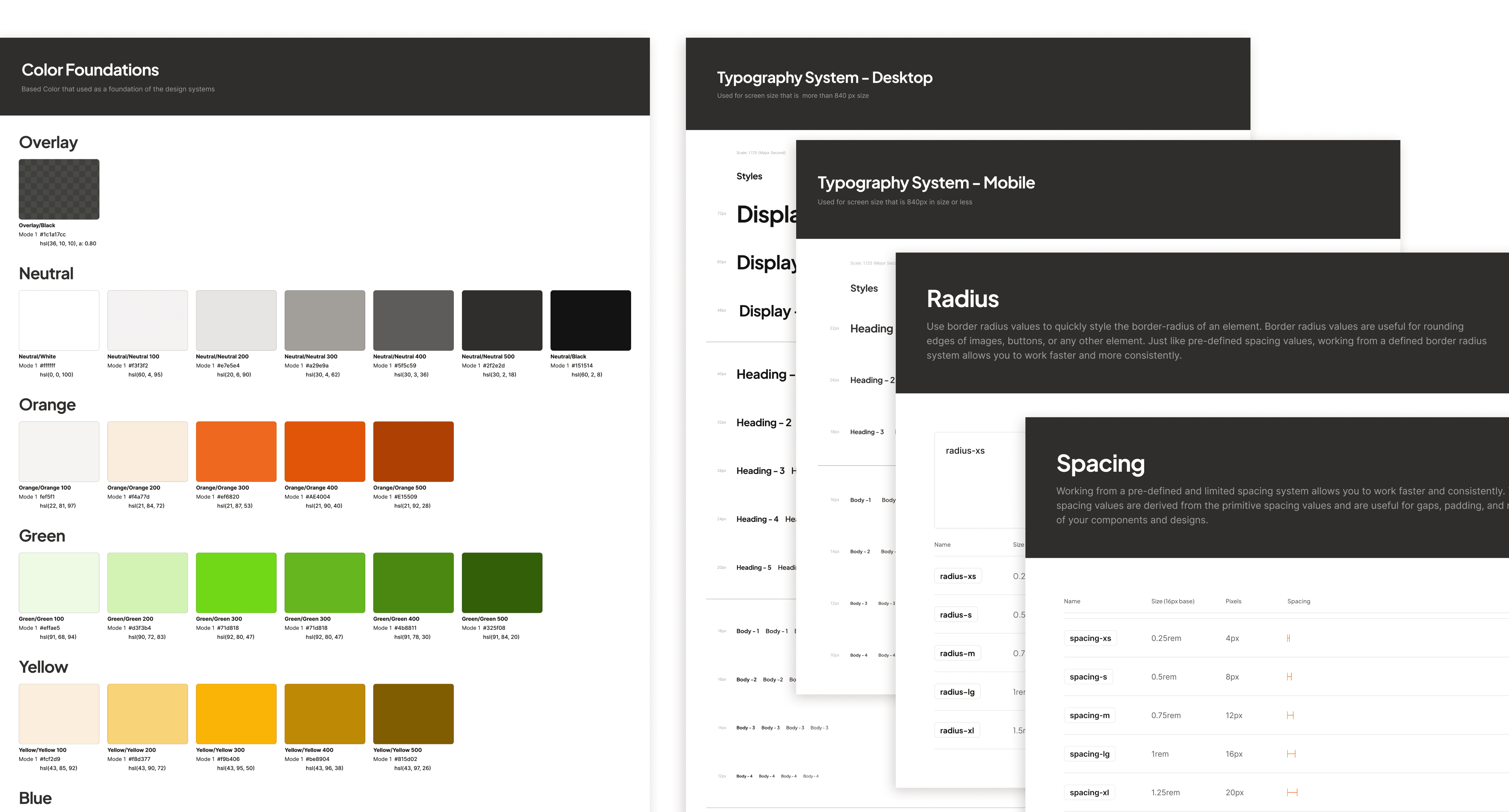
Phase 1: Visual Foundation
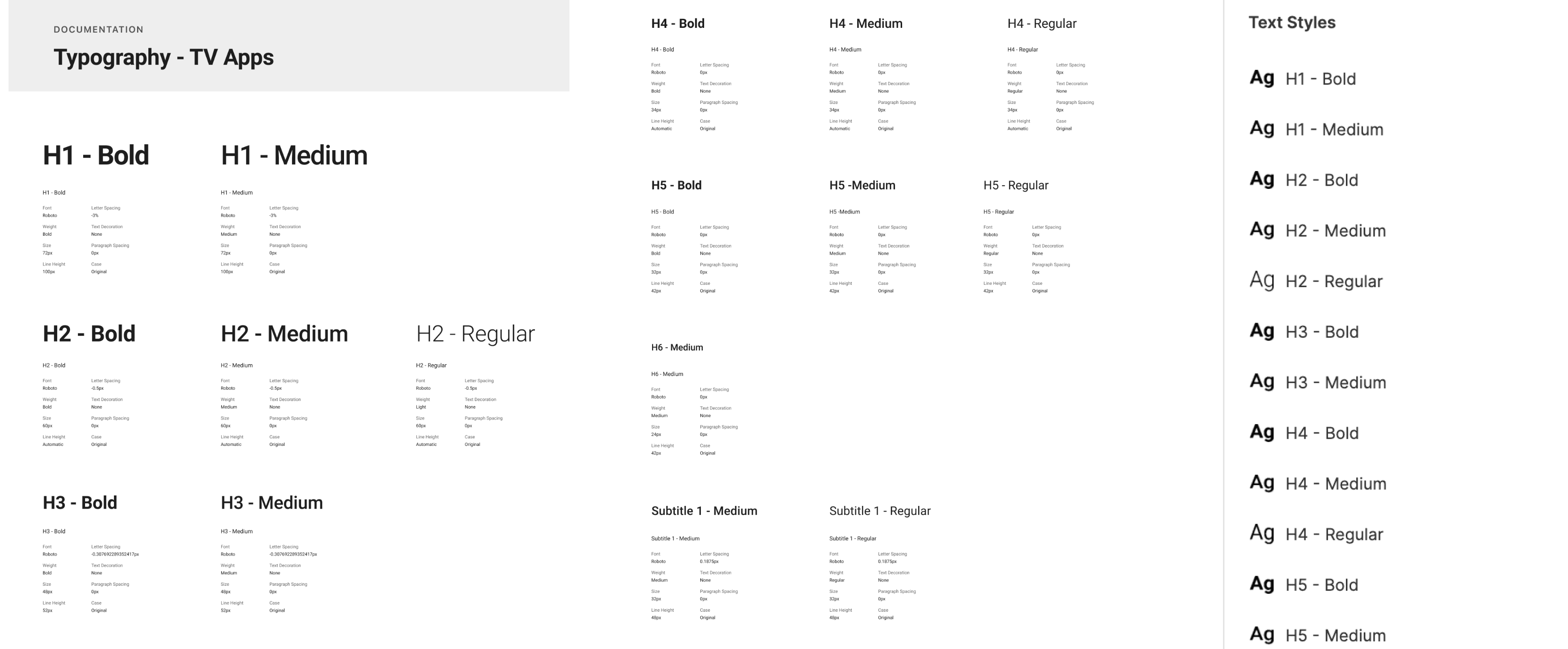
Typography Tokens
This meticulous rebuilding process established the single source of truth. This foundational work included clear, well-documented guidelines for key elements:
Color Tokens
Formalizing the application's color palette, moving away from fragmented hex codes toward a defined color system. This transition transformed the team's workflow, ensuring the consistent, high-quality user experience that the Vidio TV Apps needed for its long-term success.

Iconography
have extensive experience in creating and managing comprehensive icon libraries, ensuring every icon adheres to a single, unified system:
Establishing the Rules
I begin by defining a clear set of visual guidelines for the entire library. This includes fundamental rules for things like Grid, Stroke-Weight and Radius
Cohesion Principle
The goal of the guidelines is to ensure optical weight and style consistency. For example, every icon must share the same level of detail, perspective, and use of negative space. This prevents any single icon from looking "out of place."

Phase 2: Reusable Components
Build Reusable Components
Leveraging the new Figma foundation, I built the essential, reusable components required for the Vidio TV Apps interface.
Component Creation
The most important task was creating reusable design components for common UI elements like buttons, cards, and page templates used throughout the application.
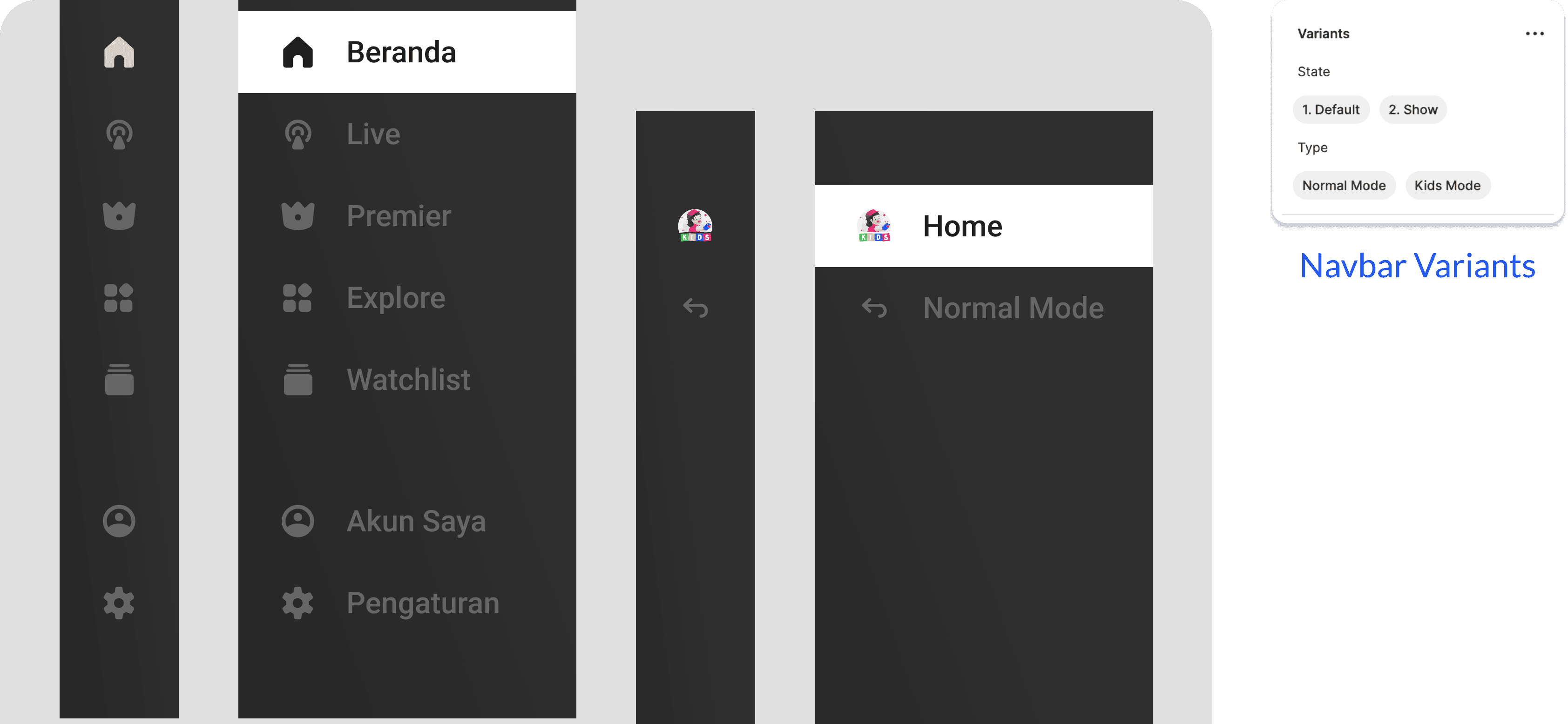
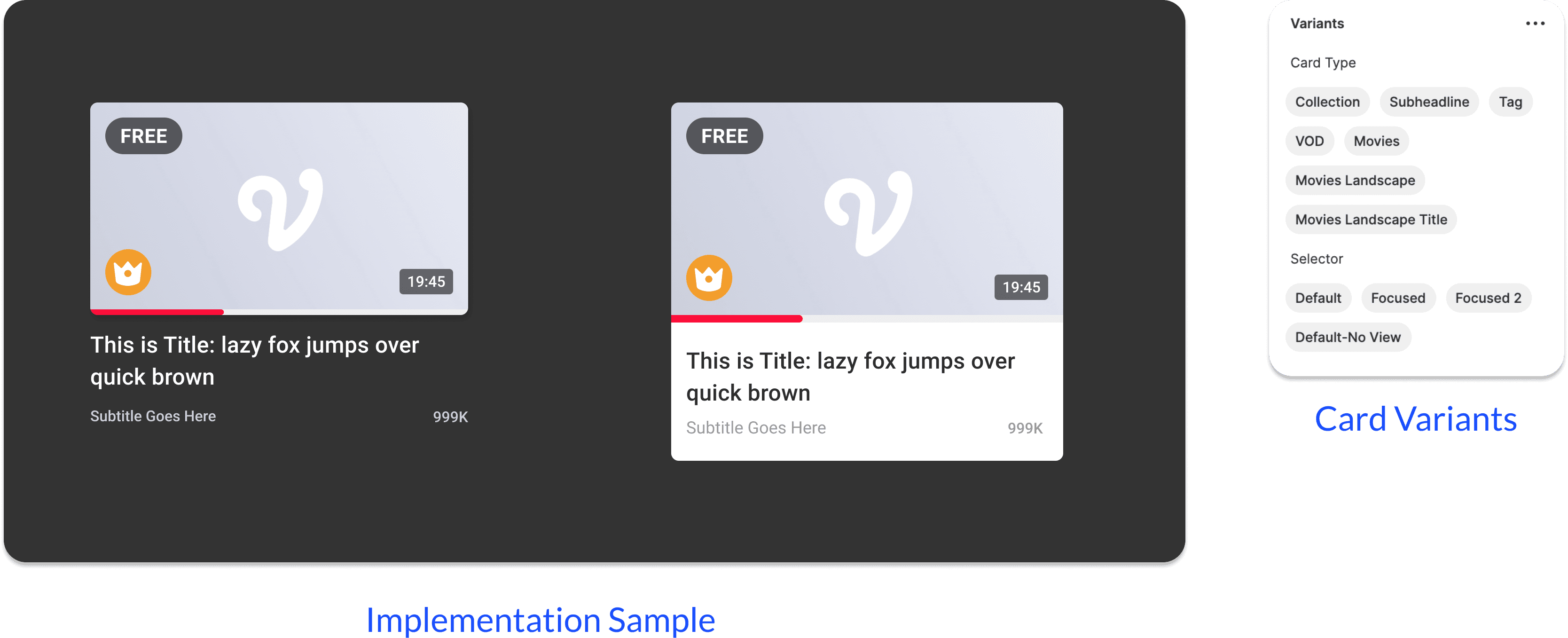
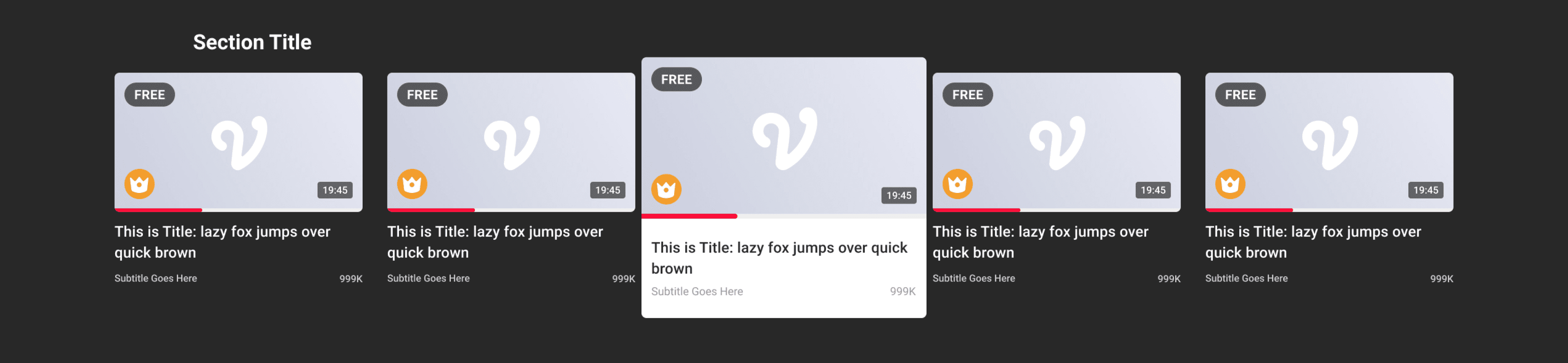
Variants for Efficiency
Figma Variants were crucial here, allowing designers and engineers to easily switch component states and properties, which dramatically improves efficiency and ensures consistency.
Button

Navigation
Cards Components
Result
Impact & Results: Quantifiable Success
The implementation of the Vidio TV Apps Design Library achieved its core goals, resulting in measurable improvements across design velocity, product consistency, and cross-functional collaboration.
Optimized Design Velocity and Efficiency
Design Team Feedback
My colleagues reported a significant acceleration in their workflow, noting that designing new features and communicating design decisions became much faster due to the unified, documented component library.
Designer Workflow
My own project work became substantially faster, as the need to "re-make the same component" was entirely eliminated, allowing me to focus on complex user problems rather than basic UI construction.
Improved Consistency and Quality
UI Consistency
The formalization of Typography Styles, Color Styles, and Iconography Guidelines guaranteed a consistent look and feel across all TV Apps screens, directly resolving the "user confusion" problem.
Reduced Rework
The standardized components led to cleaner, more predictable designs that met a higher bar for quality.
Enhanced Cross-Functional Collaboration
Engineering Feedback
We received positive feedback from the engineering team, who found that the reusable components and clear documentation made developing and implementing the UI significantly easier.
Streamlined Handoff
The system minimized back-and-forth communication regarding component specifications and behavior, resulting in a more efficient and productive collaboration between designers and developers.
Summary
The Design Library successfully made design more efficient, improved consistency, and fostered better collaboration between all stakeholders, proving the value of a strategic, systems-focused approach to Product Design.